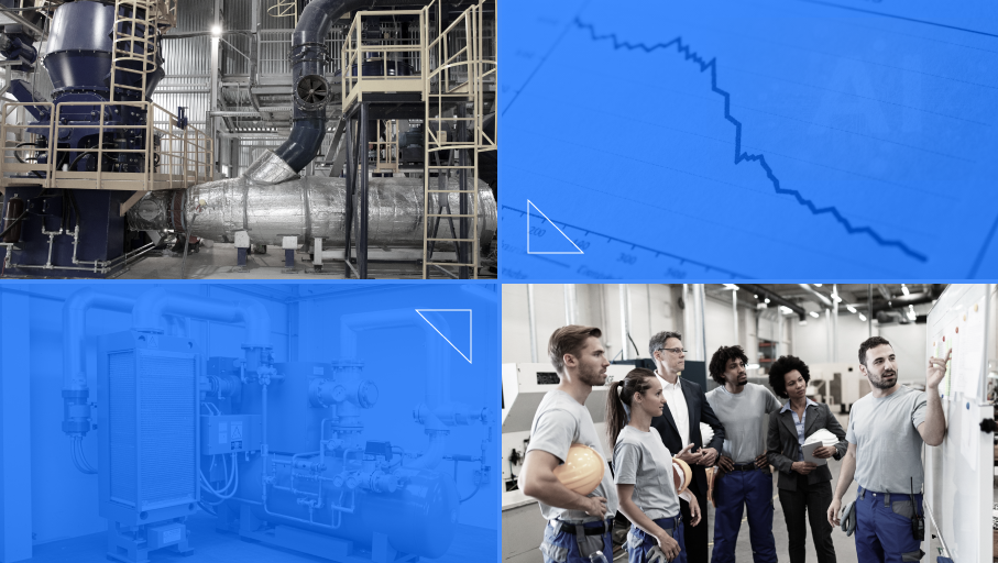
Data Visualization Software makes large volumes of operational data much easier to read. For many people, visually accessible data is very easy to read. If it is necessary to process a huge amount of data, the appropriate presentation of information is essential. See how we increased efficiency and improved the work of one team of a major water and sewage company.
Our client, the City Water and Drainage company in Wrocław (MPWiK – Miejskie Przedsiębiorstwo Wodociągów i Kanalizacji), collects that amount of data every day at the Mokry Dwór Research Station.
Data Visualization Software Challenges
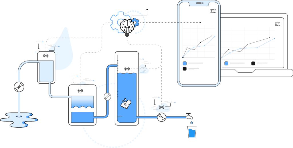
MPWiK Wrocław approached us with a request to create an application that would allow clear graphical visualization of the measurement values of water parameters collected at subsequent stages of the water treatment process at the Mokry Dwór Research Station. This data was gathered through the existing SCADA system. Although the client already had charts, they were not sufficiently accessible for employees. Comparing different types of data was also challenging and time-consuming. Based on the original charts, it was very hard to get the full picture, especially when the values of each parameter on a monthly scale were presented on 30 separate charts — one for each day.
Project Requirements
MPWiK Wrocław wanted to:
- interactively change parameters and data range
- access data in the form of tables and charts
- compare data within a selected time interval and units
- present measurements for the same parameter, using the same unit, from different sensors within one graph
- use the application on different devices, both web and mobile
- assign employees personalized accounts protected by login and password
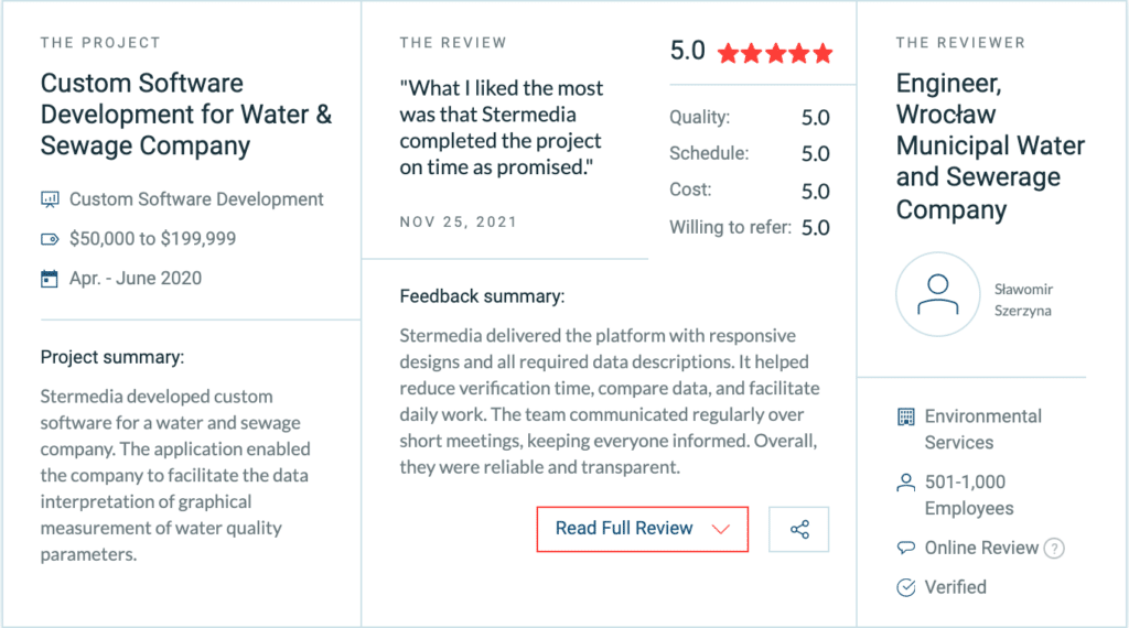
Our project was characterized by many requirements and tasks for Stermedia programmers. Thanks to our use of SCRUM methodology throughout our work, we successfully completed the project on time.
Sławomir Szerzyna, Engineer Specialist at the Center of New Technologies, MPWiK
Solution Architecture
For this Data Visualization Software project, the client provided a description of the data series that needed to be displayed. Based on these specific needs, we selected proven methods, including ready-made frameworks and libraries. This helped save time and budget, allowing us to focus on the most important work. The project was divided into two microservices: a frontend written in Angular 9 and an API backend written in Python using the Django framework. The system communicated with the Microsoft SQL database to retrieve data in real time.
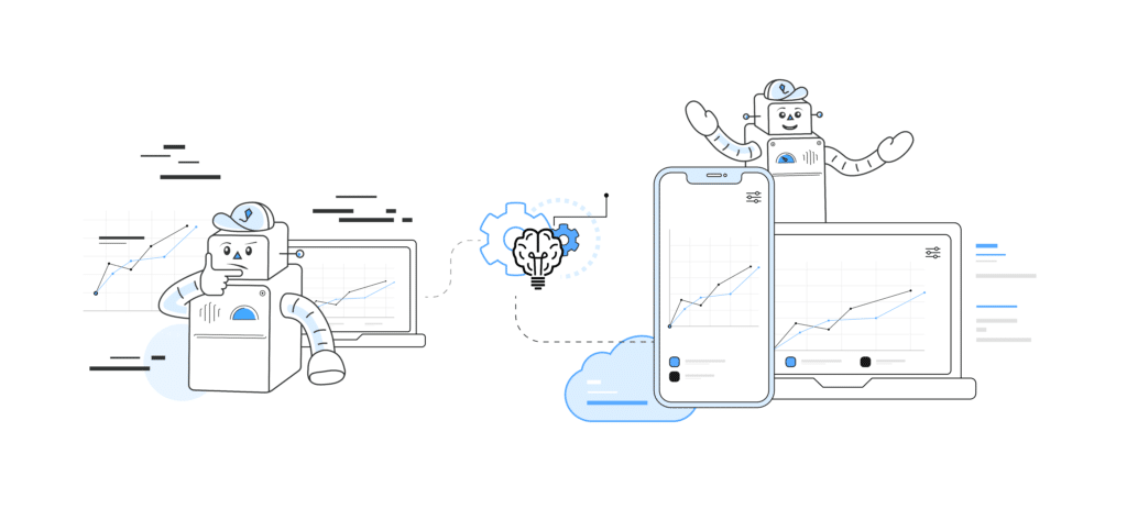
We successfully implemented both microservices in parallel. The frontend part was developed on the basis of sample data and only later connected with the backend. As part of the backend work, we created the environment and built its skeleton using the selected frameworks. The next step was to solve the issue of transferring data from the MSSQL database and configure the appropriate endpoints to download the required data.
The new look of the system for Mokry Dwór Research Station in the City Water and Drainage company in Wroclaw means better quality for many employees. It is a joy to participate in a project that has helped many people.
Michał K., Software Engineer, Stermedia
Handling Mapping Errors
We faced the challenge of working with the database on the backend and mapping data series on the frontend. The data was stored in a database where the rows corresponded to subsequent measurements and the columns corresponded to data series. The problem was that several sensors had changed position, but the names of the columns storing their readings had not been updated. With a large overall number of sensors, this caused several mapping errors. Finally, thanks to very good communication with the client and their domain knowledge, we correctly verified all endpoints. Daily short team meetings, sometimes attended by the client, were useful in this regard. Thanks to this way of working, each party was aware of the current arrangements and could freely exchange knowledge.
Results of the Data Visualization Software Project
As a result of our work in the SCRUM methodology, we delivered a Data Visualization Software solution that greatly facilitates the interpretation of data. It allows users to freely choose the scope and type of presented data. In addition, interactive charts allow checking the value at any point and zooming in on a selected fragment on both the OX and OY axes.
The tool created by the Stermedia team also allows data to be presented in the form of tables and exported as CSV files. Thanks to the Responsive Web Design approach, the application is suitable for use on desktops and laptops, as well as on mobile devices.
Our agile approach made cooperation with the client very effective, and the final product fully met the initial assumptions. The time needed for data verification decreased significantly, and the implemented improvements opened up new possibilities for comparing data.
Technologies Behind the Data Visualization Software
Frontend – Angular 9Backend – Python API, Django framework, Microsoft SQL database
Photo source: MPWiK‘s own archives
Movie source: MPWiK’s YouTube channel
Are you inspired?
Let’s talk about your idea.
Let’s talk
Next steps & further reading
If you want to explore how data visualization software can improve operational visibility and day-to-day decision-making, the best starting point is a small, controlled pilot.
At Stermedia, we help public institutions, industrial teams, and established organizations build software for reporting, analytics, and clear data presentation — from needs analysis and proof of concept to implementation and production rollout.
Want to discuss your project? Contact our team.
Continue reading:
- AI-Driven Energy Management System for Industrial Compressors – This case study shows how an AI-driven system helped optimize industrial compressor performance, reduce energy waste, and improve operational visibility.
- Improving Production Lanes of An Automotive Giant – This article presents a solution that helped factory teams resolve production-line issues faster through smarter recommendations and clearer reporting.
- Presentation of 3000 Records a Day in an Accessible Way – This case study explains how Stermedia built an application that made large volumes of measurement data easier to visualize, compare, and verify.